Mean Reversion and the Next Decade: Where Might DIA and SPY Be in 2035?
Introduction — When the Curve Gets Ahead of Itself
Across the first four parts of this series, we have slowly built a single, coherent way of understanding wealth.
In Part I, we met the Farmer’s Compounding Garden: a simple, almost childlike story that revealed a profound truth: compounding is quiet for a long time, then overwhelming for those who stay.
In Part II, we translated that garden into financial principles. We learned that wealth is not built in years but in decades, that progress arrives in doublings, and that the classic Financial Independence target of 25× living expenses falls between your fourth and fifth doubling; right where the curve becomes steep.
In Part III, we stress-tested the metaphor against real markets using an intentionally artificial rule: buying one share per year regardless of price. That method is unrealistic, but it stripped away all optimization so we could see how compounding feels when volatility is allowed to speak loudly.
In Part IV, we turned to how real people actually invest — steady dollars, steady habits, and a Dollar Cost Averaging (DCA) approach. That shift improved outcomes, because disciplined investors naturally buy more shares when prices are low and fewer when prices are high.
Across Parts III and IV, one consistent pattern emerged:
For roughly the first twenty years, market returns tended to oscillate around the garden’s implied compound curve. Then, in years twenty-one through thirty, both DIA and SPY clearly broke out above it.
That observation leads us to the central idea of Part V.
Introducing Mean Reversion
Before going further, we need to define a critical concept.
Mean reversion is the long-run tendency of market returns to drift back toward their historical average after periods of unusually high or unusually low performance. Markets may stretch far above or below their long-term trend in the short run, but over decades they tend to “re-center” around that average.
A simple way to picture this is an elastic band around a line. The band can stretch far above or below the line, but over time it is pulled back toward the middle.
This idea does not tell us what will happen next year. It does, however, give us a powerful framework for thinking about the next decade after an extraordinary one.
That is the purpose of this final article.
The Garden and the Market — A 30-Year Race
Look first at the visualization comparing the Farmer’s Compounding Garden to DIA and SPY under the “one seed per year” method. (See figure 1 below). Here you’ll see the market (DIA and SPY) generally follow the Farmer’s Garden for the first twenty years. But starting in 2016 you see the market begin to outperform, then breakout after its decline in 2022.
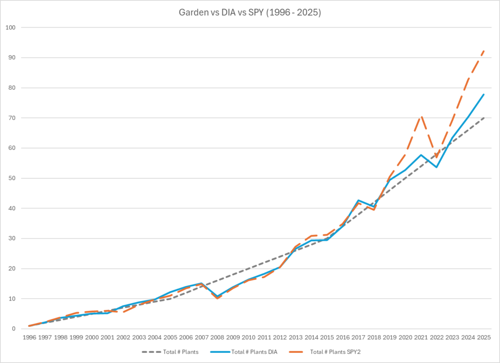
Figure 1: The Farmer’s Garden compared to the Market (DIA and SPY) in # of Plants.
What this graph shows is not perfection, but pattern. During the first two decades, the market moves above and below the garden curve. There are years of excitement, years of collapse, and long stretches where progress feels painfully slow.
Then, over the full thirty years, both DIA and SPY ultimately rise above the garden’s steady path. This tells us something essential:
The garden is neither too optimistic nor too pessimistic. The market can (and sometimes does) beat it. But it does so in a volatile, emotionally difficult way. The market also can (and sometimes does) underperform the market over a long, consecutive periods of time, testing an investor’s staying power.
The garden compounds smoothly. The market compounds in waves.
Investing Like a Real Person — Dollar Cost Averaging
Now turn to the visualizations that compare the Dollar Cost Average paths of DIA and SPY to the garden’s implied 30-year growth rate. (See figures 2 (DIA) and 3 (SPY)).
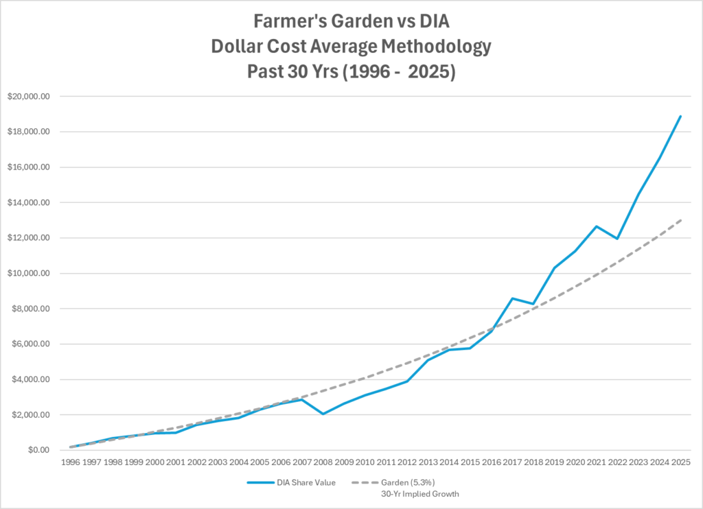
Figure 2: Dollar Cost Average Returns (Market (DIA) compared to the Farmer’s Garden)
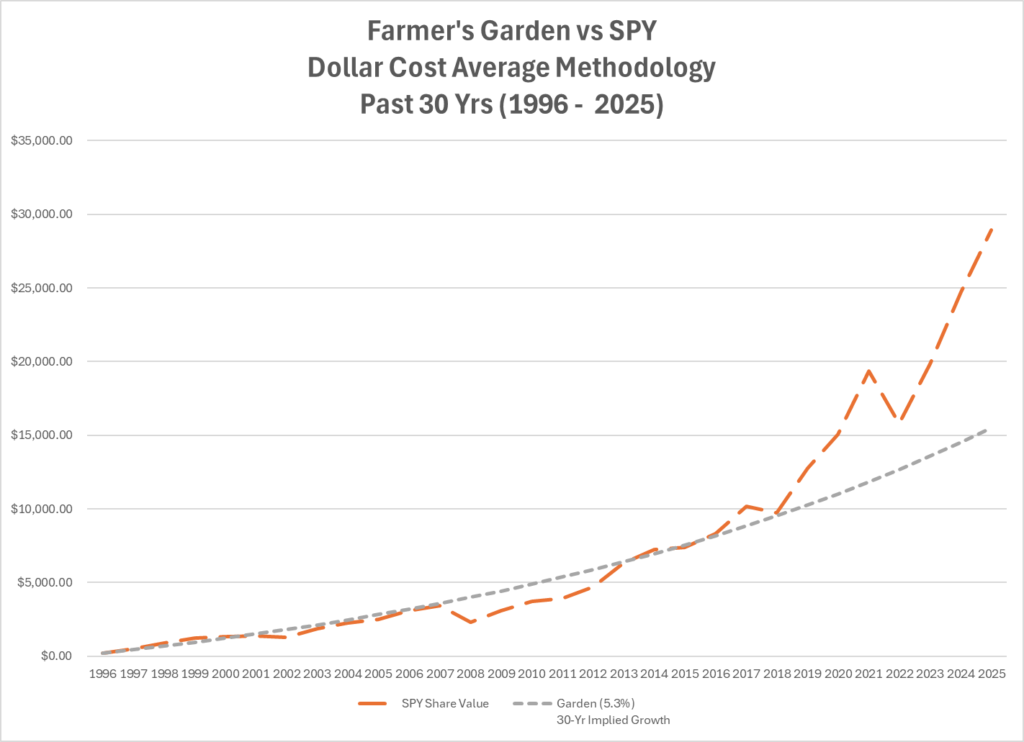
Figure 3: Dollar Cost Average Returns (Market (SPY) compared to the Farmer’s Garden)
Figures 2 and 3 matter because they reflect how real investors behave: contributing the same dollars each year rather than buying a fixed number of shares. What these visualizations reveal is subtle but important.
For roughly twenty years, both DIA and SPY hover near the garden’s smooth curve. Sometimes they are above it; sometimes below it. But they do not yet look dramatically different.
Only in the final decade do both indices decisively pull away. This reinforces a core lesson from the entire series:
Dollar Cost Averaging does not remove the emotional test of investing. It simply increases the probability that disciplined investors stay in the game long enough for compounding to work.
The Market’s Elastic Band
Now look at the historical visualization that overlays three potential garden’s curve with actual market performance from 1996 to 2025. (See Figures 4 (DIA) and 5 (SPY)). The three potential garden curves represent the implied 30-yr growth rate (5.3%), 50-yr growth rate (6.2%), and a double every 10-yrs growth rate (7.17%) of the Farmer’s Garden.
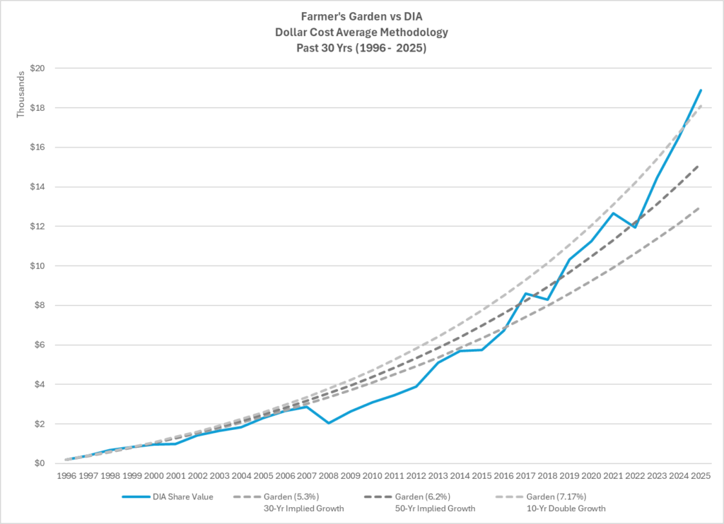
Figure 4: Market (DIA) Returns Compared to three different Growth Rates (5.3%, 6.2% and 7.17%)
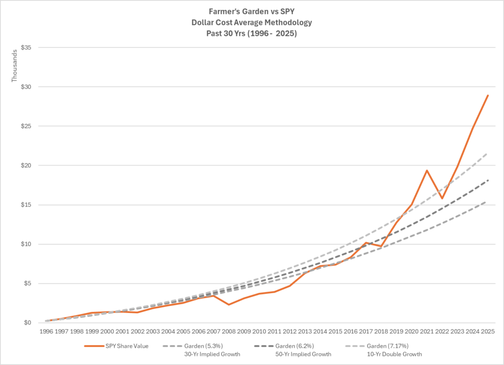
Figure 5: Market (SPY) Returns Compared to three different Growth Rates (5.3%, 6.2% and 7.17%)
You can clearly see mean reversion in action.
- In the late 1990s, the market ran ahead of the garden.
- After the dot-com bust, it fell below it.
- The 2008 financial crisis pushed it far beneath the curve.
- The decade after 2009 acted like a powerful “catch-up” rally — and eventually an overshoot.
That overshoot is what matters for the future. When markets run far ahead of their long-term trend, they do not usually continue at the same pace indefinitely. Either returns slow, markets move sideways, or time allows the garden curve to catch up.
That is mean reversion in practice.
Where We Stand in 2025 — Three Benchmarks
Let’s examine Figures 4 and 5 that compare DIA and SPY in 2025 against three garden benchmarks:
- Lower bound — 5.3% (30-year implied garden rate)
- Middle bound — 6.2% (50-year implied garden rate)
- Upper bound — 7.17% (10-year doubling rate)
These are not arbitrary. They represent three distinct ways of thinking about long-run compounding. When we place DIA and SPY against these curves in 2025, the picture is striking.
DIA sits just above the upper bound ($18,874.33 vs. $18,100.42). DIA has had a strong run, but it is not wildly detached from history.
SPY, however, sits well above even the most aggressive garden path ($28,917.10 vs. $21,599.77).
This is precisely the kind of situation where mean reversion becomes a reasonable expectation. The further an asset stretches above its long-run curve, the harder it becomes to justify continued outsized growth without a pause, pullback, or normalization.
What Mean Reversion Implies for the Next Decade
Now look at the forward-looking visualizations for 2026–2035 that project three possible paths for each index.
These are not forecasts. They are implied paths: the constant annual returns that would be required for DIA or SPY to drift back toward each garden benchmark by 2035. (See figures 6 (DIA) and 7 (SPY)).
DIA’s Possible Decade
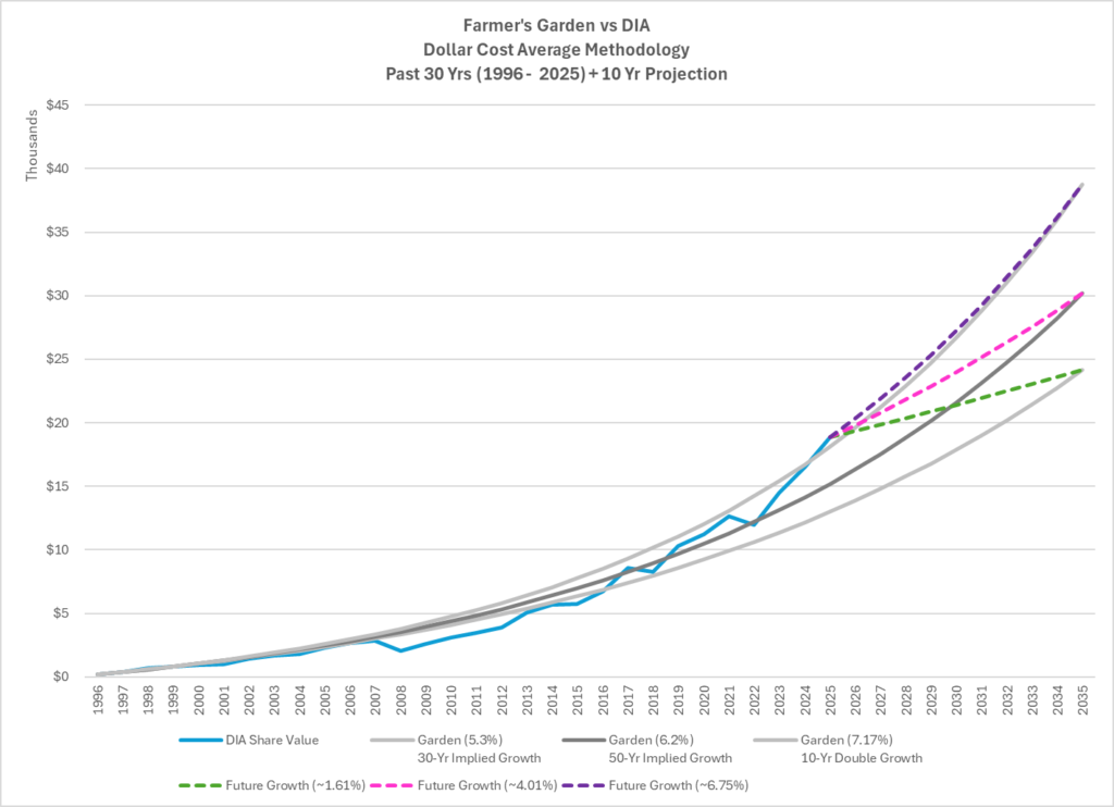
Figure 6: Means Reversion: Where might DIA go in the next 10 years?
Let’s examine figure 6. Starting from its 2025 level, the graph shows three potential paths:
- A slow path requiring about 1.6% per year, which would pull DIA back toward the garden’s 5.3% curve.
- A moderate path of about 4.0% per year, aligning with the 6.2% garden benchmark.
- A high path of about 6.7% per year, keeping DIA near the aggressive doubling line (7.17% growth rate).
Given DIA’s strong recent performance, the most plausible zone lies between the slow and moderate paths. The highest path is possible, but harder to justify as a base case after such a strong decade.
SPY’s Possible Decade
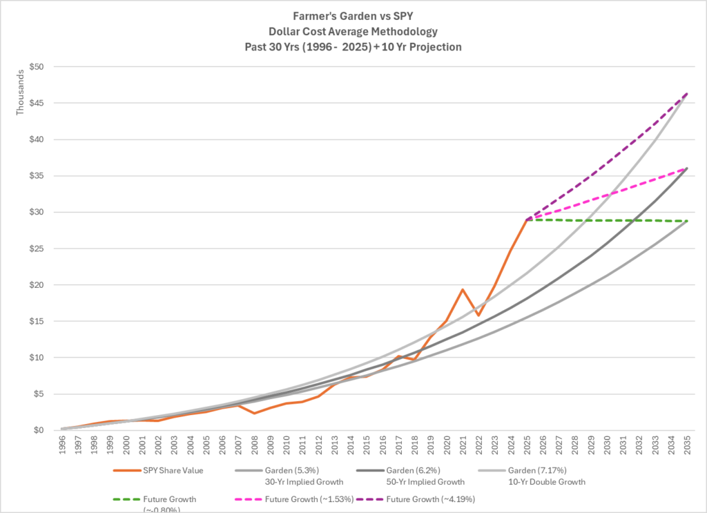
Figure 7: Means Reversion: Where might SPY go in the next 10 years?
Let’s examine figure 7. The SPY visualization tells an even clearer story.
Because SPY is already far above the garden curve in 2025, its implied future returns look very different:
- To return to the 5.3% path, SPY could actually lose a small amount each year and still land there by 2035.
- To align with the 6.2% path, SPY would only need about 1.5% per year.
- Even to stay near the aggressive doubling (7.17%) path, SPY would only need about 4.2% per year, far below its recent pace.
This is classic mean reversion. A decade of modest or even flat performance would not be failure; it would simply be normalization after extraordinary growth.
What This Means for Investors
Here is the critical insight that ties everything together. Markets are unpredictable year to year. But over decades, they tend to move toward a mean.
The last ten years were unusually strong. That does not mean the next ten will be bad. It does mean they are unlikely to look the same.
For DIA, a reasonable expectation is slower growth than the past decade — somewhere in the low-to-mid single digits.
For SPY, a decade of low single-digit returns — or even sideways movement — would be entirely consistent with mean reversion and still leave investors on a healthy long-term path.
And this brings us back to the Farmer. The farmer did not plant because he knew exactly how fast the garden would grow each decade. He planted because his job was to show up, every year, regardless of the season. That is the ultimate lesson of this entire series.
Your role is to plant.
Time’s role is to multiply.
The market’s role is to fluctuate.
If you understand that, you win, regardless of what the next decade looks like.
Conclusion
The Farmer’s Compounding Garden is not just a metaphor for how wealth grows. It is also a framework for how to think.
Over the past thirty years, real markets broadly followed the garden’s curve, then outpaced it. Mean reversion suggests that the next decade is more likely to be a period of normalization than a repeat of recent explosive growth.
But for the disciplined investor, that does not change the plan.
You keep investing.
You keep dollar-cost averaging.
You keep planting seeds.
Because compounding does not reward the person who starts, it rewards the person who stays the course. And that, more than any chart, is the real lesson of the Compounding Garden.